Interior Design Fundamentals
When we begin the design process with our clients and start putting our pens to paper, we develop an abundance of thoughts, plans and ideas. Brainstorming and collecting inspiration helps us develop a mood board that aligns with our client’s vision. Our team relies on a variety of wedding sources for inspiration; however we also turn to sources outside of our industry. Interior design, architecture, fashion, product design and travel heavily influence our overall aesthetic and approach to design. After we compile our various inspiration pieces, we edit and refine our concepts to make sense of our ideas and choose the ones that will work best for our client and the event space. A successful event always incorporates the elements of design. Therefore we rely on the following 6 principles when envisioning and creating an event: Function, Balance, Scale & Proportion, Emphasis, Rhythm and Harmony.
Function. Photo by Kate Krueger Photography
Function
Though it is easy to get carried away with lovely linens and meticulous place settings, the first step to designing a spectacular event is establishing a functional floor plan. Many of our events take place in the Midwest. This means our weather isn’t always consistent (how lucky you West-Coasters are with perfect California weather!). It is essential to have a rain plan. We always prepare for the unexpected by creating a floor plan that is malleable and can transition from the perfect, sunny day to a button down the hatches, stormy afternoon. If the latter should occur, you could have 300+ guests enclosed in the same tented space from the beginning of the ceremony until the band plays the last song of the evening. Sounds like a nightmare, right? Not when you have a functional floor plan that implements the fundamentals of interior design!
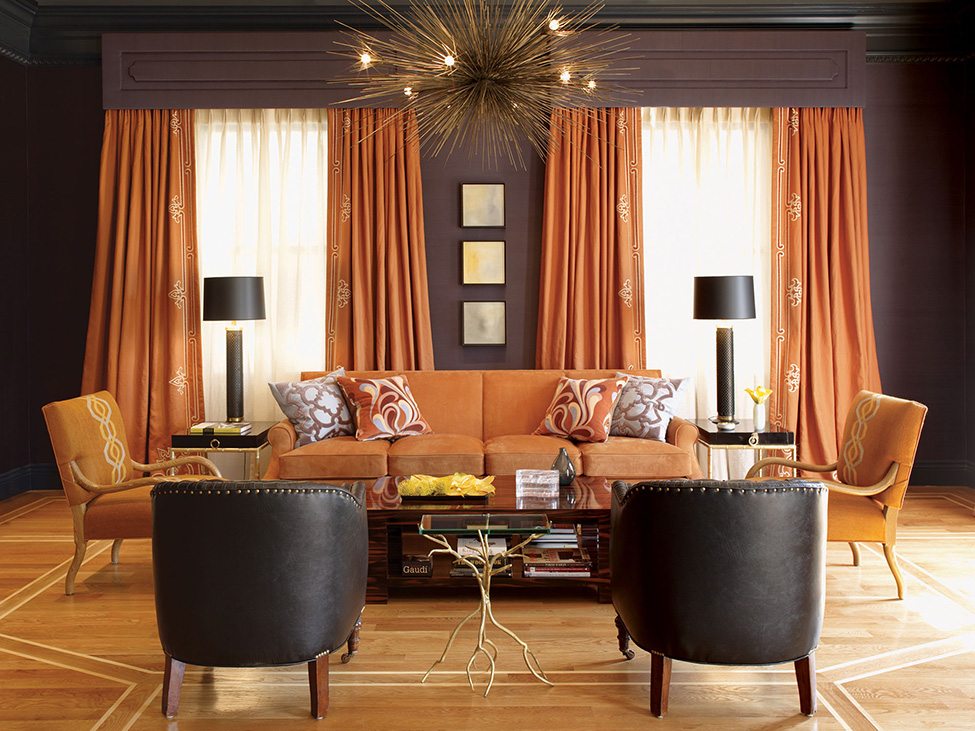
Symmetrical Balance. Photo via Geoffrey De Sousa Interior Design
Balance
Balance can be defined as an equal distribution of weight. There are three styles of balance: symmetrical, asymmetrical and radial.
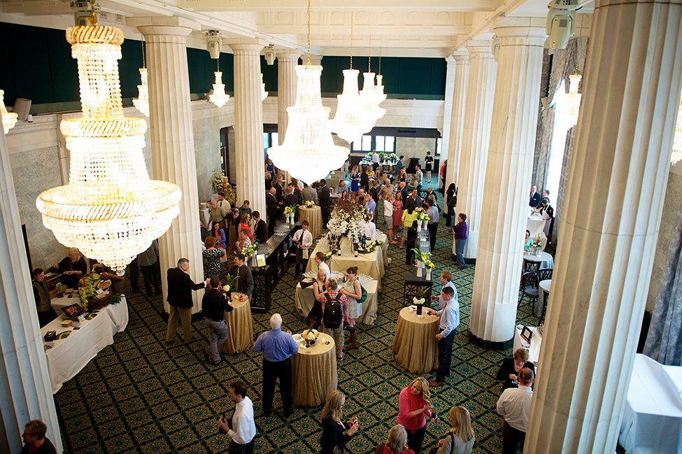
The symmetrical floor plan is pleasing and understandable to the eye. It is also the one in which we are most comfortable. If you drew a line down the center of the room, both sides would be exactly the same. The plethora of opportunities to create and design in a symmetrical space is abundant. There’s something incredibly dramatic and awe inspiring in a space where everything lines up perfectly and not a single thing is out of place.
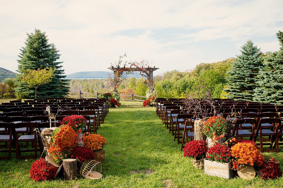
Asymmetrical Balance. Photo by Jen Kroll Photography
Asymmetrical balance is more casual in feeling and promotes movement about the space- perfect for a strolling reception! This form of balance is a bit more difficult to achieve. When creating a floor plan with asymmetry, the key is to place differing objects or furniture pieces with similar visual weight across from one another.
Radial Balance. Photo by Jen Kroll Photography
When you envision radial balance, imagine a sunburst where all the rays are extending from a single center point. Oftentimes in wedding and event design, the stage and dance floor end up being the central point with the guest tables arrayed around. This allows the dance floor to become the focal point, visible to all guests during important points of the evening such as the couple’s first dance.
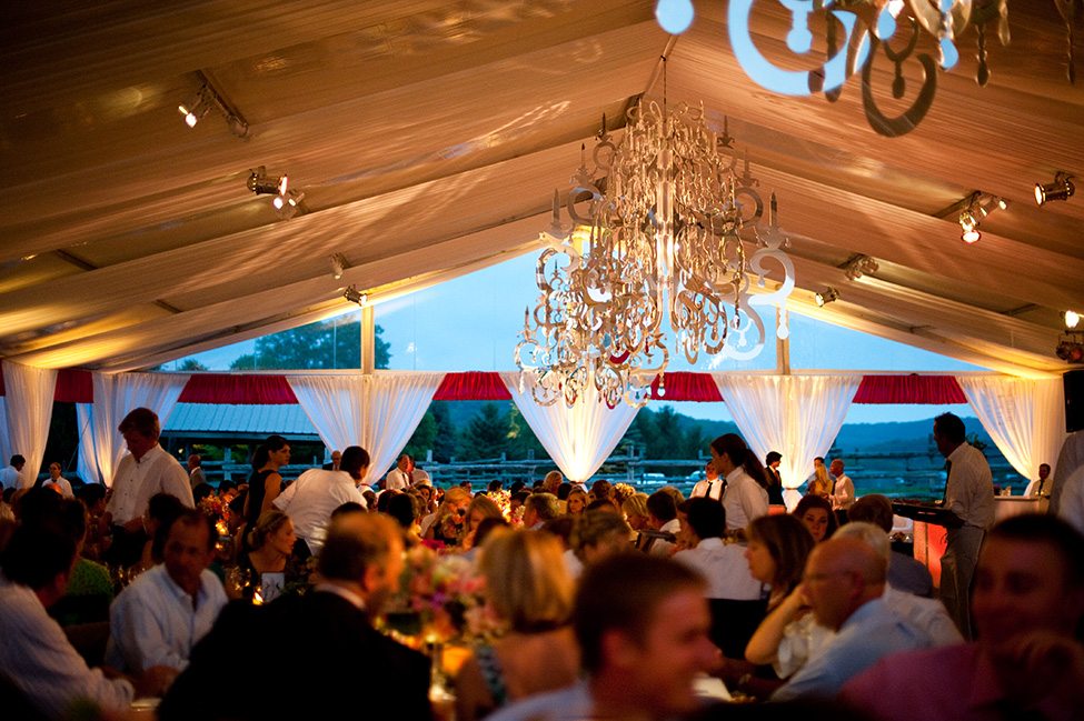
Scale & Proportion. Photo by Studio 6.23
Scale & Proportion
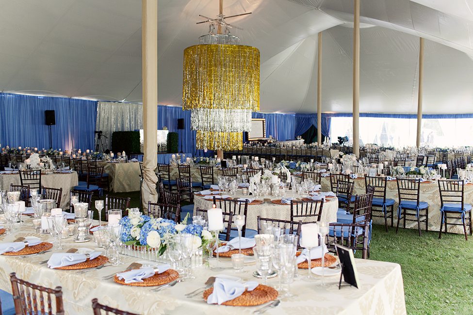
These two fundamentals of design go hand-in-hand when designing in large ballrooms or tented spaces where it’s not uncommon for the ceiling height to be twenty feet or taller. With large spaces, it’s important to remember scale- for example a 24-inch diameter chandelier would easily get lost when hung fifteen feet up in a large tent or ballroom. Proportionally, that same 24-inch diameter chandelier, in the same large tent or ballroom, now becomes appropriate when centered over a guest table and hung three feet up from the tabletop.
Emphasis. Photo via Jessica Helgerson Interior Design
Emphasis
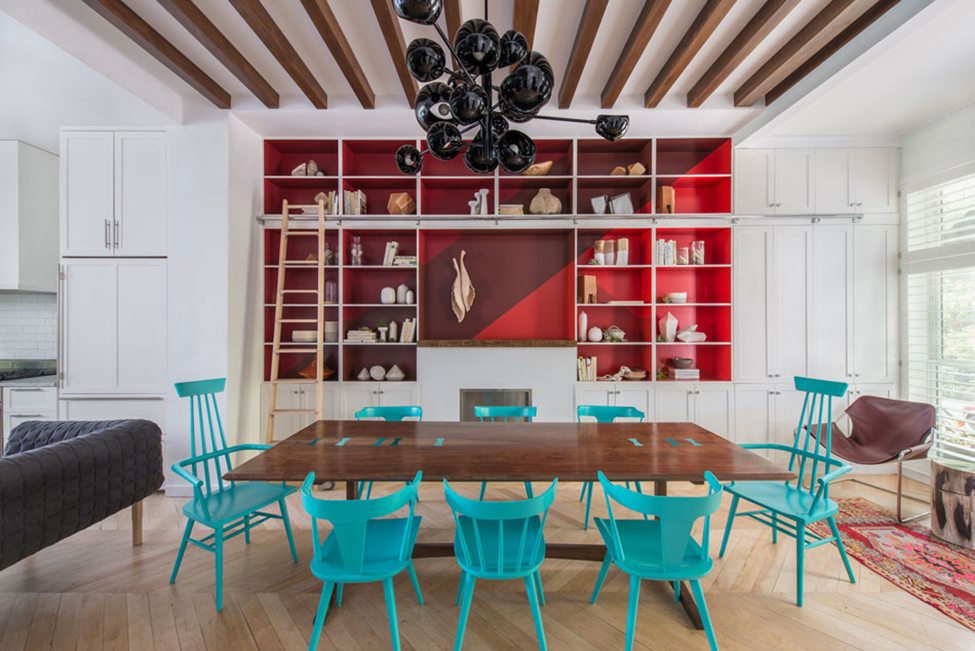
Emphasis is your focal point or the spot to which all eyes are drawn. While we never want to take away from the happy couple (especially the blushing bride!), every good design has intentional focal points. In a single room reception, this can often be the stage where dancing and entertainment will take place. The stage is a no brainer and usually calls for something unique, fabulous and eye catching. The focal point should catch everyone’s attention and inspire conversation. Think amazing pieces of art or fabulously constructed custom casework featuring your grandmother’s vintage china! Another great spot of influence is the guest arrival area- making an impact at a first impression is always a good thing!
Rhythm. Photo by Jen Kroll Photography
Rhythm
The best floor plans have rhythm, an ebb and flow. They are functional while also giving room and breathing space for life to happen. No one would be happy at an event if there wasn’t room to move about and mingle with friends, old and new. It would certainly be an uncomfortable experience if the caterer was bumping into chairs and asking guests to scoot in toward their table as they are serving dinner. The rhythm, or flow, of a particular space is number one in our book!
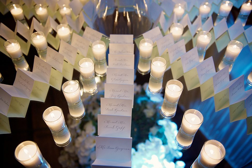
Harmony. Photo by Michael Poehlman Photography
Harmony
Harmony: Ultimately, this is what the wedding weekend is about! Uniting two people, two families, two groups of friends. It makes perfect sense that in order to create a great wedding design, one must achieve harmony. This means that all of your design elements from the very tiny place card to the very large chandelier are all working together to create unity. This, above all things, is what we strive for in design. We certainly don’t work for the compliments, but when a guest tells our team that the design of the wedding is a true reflection of the couple, we have done our job! We’ve achieved the ultimate goal and have united two people into a design that is seamless and embraces the unique qualities of our beloved couple.

