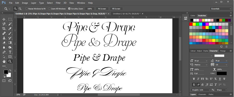
The Perfect Type
As we mentioned in last week’s “Stationery Spotlight,” your stationery is one of the first strong design elements for your wedding and special events. Fonts are a great place to start in the stationery design process. The typefaces you select, combined with your color palette, the paper weight, texture and any additional embellishments all work together to convey the style of your event. The resurgence of handlettering and calligraphy has all of us in love, but we’ll save those two beauties for another post!
Before you begin selecting fonts for your invitation suite and branding elements at your event, it is important that you have an understanding of the style and feeling you want to evoke at your wedding. Are you classic or contemporary? Rustic or coastal? Casual or whimsical? The wording on your invitation conveys information to your guests, but the style of that text communicates just as strongly. If you choose a traditional, calligraphic typeface, your guests can gather that your event will be quite formal. A looser, hand lettered style provides a more casual, intimate feeling.
An elegant, timeless typeface will convey a classic, formal style. If you are hosting a modern fete, a sleek, minimal font with clean lines will do the trick. Old world font styles that hint at a different era can capture your vintage style perfectly!
The fonts you select of course should be beautiful to the eye, but it is essential that they are readable. You wouldn’t want your guests struggling to read their program or dinner menu because the type was small or difficult to read. Think about your guests and the function of the pieces you are using the typeface for.
We usually recommend mixing 2-3 different fonts to add interest to your invitation suite and branding elements. There are 3 basic types of typefaces: serif, sans serif, and script. To create contrast, it is common to combine a script typeface style with a sans serif typeface. Use the beautiful script typeface for your names or larger headings so you can see the details and unique qualities of the letters, and designate a more simple, sans serif font for smaller text and body copy.
Selecting your wedding fonts can seem like a daunting task. Here are an assortment of our favorite resources to find fonts and lettering inspiration to get you started- Happy Font-ing!!
MyFonts
We love this tool to discover new fonts and typeface designers. You can easily search by style (ie: vintage, modern, rustic). The site provides a great overview about the typeface and a gallery that lets you view various applications where the typeface was used. Our favorite feature is that you can enter your own text to see how it will look in that particular typeface. WhatTheFont is another fun feature – you can upload in image of a font and they will provide you with the actual name of the typeface or other similar results!
This site is awesome. It provides an assortment of free fonts that you can easily download and incorporate in your designs. You can sort by what’s new, what’s popular, the type classification or the style tags. Plus if you are a graphic designer, the fonts are 100% free for commercial use.
We love following this Instagram feed for daily type and hand lettering inspiration. Their colorful feed featuring themes talented designers is sure to excite! The Daily Type’s website has great tools for the aspiring designer – check our their lettering kit and online workshop!

