Stationery Spotlight: Lakeside Love Story
Stationery design is one of our favorite parts of the event design process, particularly weddings. It’s one of the first strong design elements for your wedding, as it allows you to play with color, texture and tone. Your save the date cards and invitation suite will set the tone for your guests, allowing them to envision the style and feeling of your wedding day. The beautiful printed pieces should evoke excitement and anticipation for the arrival of your nuptials, while also providing useful information that will help your friends and family plan for your big day.
Our beloved clients, Lizzy and Bucky, (to see more from this wedding visit our website!) entrusted us to design their invitation suite for their wedding on the shores of Lake Leelanau. The invitations were letterpressed with a single copper foil on a billowy, double thick stock. The custom handlettering Emily created, paired with the delicate typefaces, truly made the design the perfect canvas for embellishment. Steve Fritz, a local watercolor artist (who also happens to be Alicia’s dad!) handpainted each piece to bring depth to the simplicity of the foil, while also providing a dash of color. Each printed piece was a work of art and represented the sweet, sweet soul of our bride and groom. And without missing a beat, Mother Nature gave us the most perfect cotton candy sunset painted across the sky the evening they said “I do.” It mirrored the watercolor design beautifully!
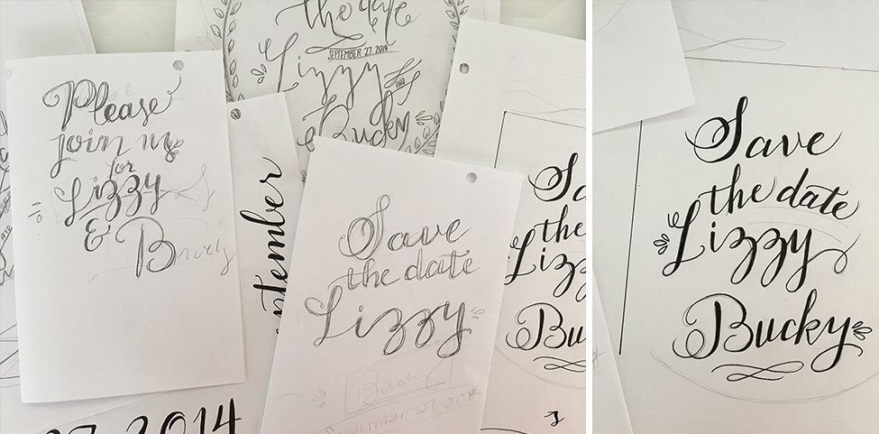
Emily’s sketching process is pictured above. It took many iterations to develop a hand lettering style that accurately represented the personality of our couple. Some designs felt too “sketchy,” and some felt too calligraphic in nature.
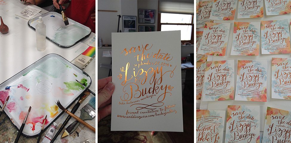
This is our watercolor work station! The center image depicts the single foil invitations before the artwork. The layout created a defined space so the artistic elements could shine through. The watercolor embellishments and the edge painting process of the Save the Dates took four artists many, many hours to complete! ‘Abstract floral’ was a large theme throughout the stationery design. We wanted to ‘hint’ that there were flowers in the design without being too literal. Our groom loves fly fishing, so within the Save the Dates, we chose to include green and blue tonalities to softly represent the river bed from his favorite fishing spots. We also opted for orange hues in the watercolors, rather than pinks and yellows, to acknowledge the changing of the seasons for this September wedding. The end result was perfect – each Save the Date card was a piece or art and had its own eccentricities within its design.
The edge painting detail is pictured above. If there is a color in your palette that is quite bold and packs some punch, Edge Painting is a great way to incorporate vivid hues. Calligraphing your guest’s names in a vibrant color is another fun touch that will add personality to your mailing envelopes. Don’t forget a beautiful stamp!
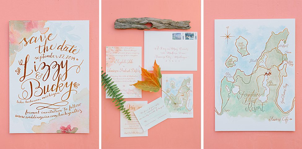
The final stationery pieces are shown above. We were completely thrilled with the end result, as we felt they were a true reflection of Lizzy & Bucky. The Bride’s favorite piece was the custom map!
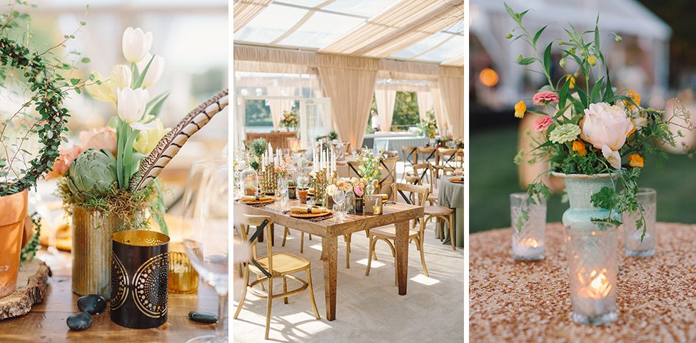
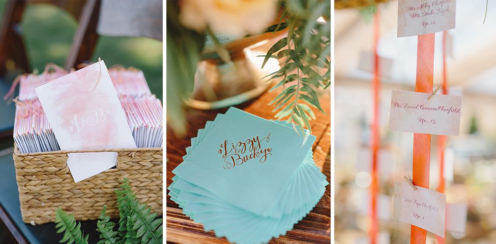
As you can see from the detail shots below, Lizzy and Bucky’s stationery pieces truly set the tone for the event. The invitations gave guests a sneak peek into the world they were going to enter at the couple’s wedding.
Keep in mind, your stationery design will also help you create the additional branded elements at your wedding (programs, menus, custom cocktail napkins, place cards and drink stirrers.) Be sure to spend some time on your invitations to ensure they are a true reflection of you and the vision you have for your wedding day!
To see more of Lizzy & Bucky’s wedding, be sure to visit their feature on Martha Stewart Weddings! Also, don’t forget to check out our behind the scenes video of the stationery design process below.
Event Photos by Harwell Photography. Behind the Scenes photos provided by A Day in May Events.

